|
Working with the Graph
The graph will initially appear as a black "hairball" in a solid black rough square. You need to spread the graph apart so that you can see the nodes and how they connect. You also need to identify clusters and color them so that the graph allows you to visualize the clusters. You also need to reduce the dimensionality to include only the most-connected kits so that the graph is not overly complex. And you need to label the nodes so that you know what you are seeing.
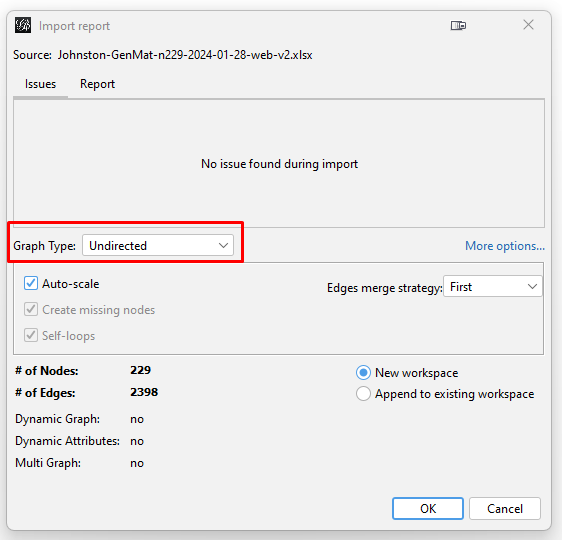
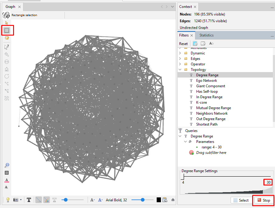
This image highlights the key places to click in the following steps.
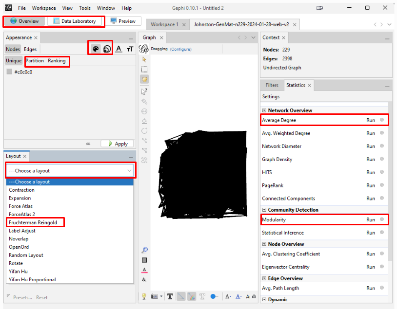
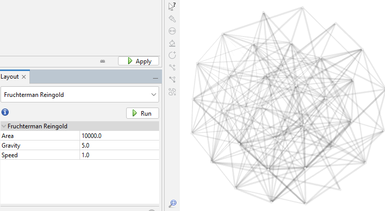
Spreading the Graph Apart: The graph's overall visual shape varies depending on which "Layout" you choose in the "Overview" tab on the left side tool bar. After experimenting with different layouts, I opted for the "Fruchterman Reingold" layout with its default parameters. Choose that layout from the pulldown menu, click "Run" and then click "Stop". You can always recenter the graph image with the magnifying glass icon at bottom left and zoom in or our with the scroll wheel on your mouse. Scrolling does focus on where on the graph you hover your cursor.

| Run then Stop
| 
|
Reducing the Dimensionality: With 229 kits in my input data, the layout spreads them out. But the result is still a "hairball" mass of so many tangled lines that it is still just solid black even at high zoom. To have a graph from which to achieve some insight, I have to reduce the dimensionality. I do this by reducing the number of kits by eliminating the kits that have fewer than some number of other kits to which they connect. On the right side tool bar, in the "Statistics" tab, click "Run" next to the "Average Degree" text in the "Network Overview" section. In my case, the resulting number is 20.943. So, the average number of connections that my testers have to each other is just under 21 connections.

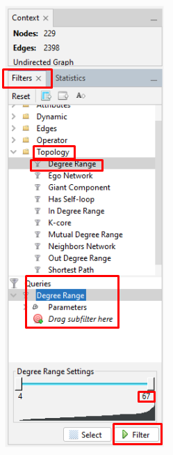
Then, click the "Filters" tab (just to the left of the "Statistics" tab). Click the ">" to the left of "Topology" (or double-click on "Topology") which opens a pulldown menu. Double-click on "Degree Range". This puts "Degree Range" into the "Queries" section below. It also opens up a chart at the bottom, showing the "Degree Range Settings". In the chart for my kits, the degree ranges from 4 to 67. Recall that the average was just under 21 connections. To eliminate the kits with fewer than some degree, I have to first select the part of the range that I will eliminate. I can either move the slider on the top end of the degree range to the left, or I can click on the number under that slider and enter a new number. For my initial exploration, I want to focus on the most-connected testers. So, I set the high-end number to "30". Then I click "Filter" below the chart. My graph will now show only the nodes (people/kits) with 4 to 30 connections. (Remember that clicking the magnifying glass recenters and zooms out the graph so that you can see the entire graph.)
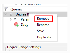
On the left side toolbar in the "Graph" window, click the rectangular box that is the second icon from the top. Then sweep to highlight the entire graph. Then zoom in so that you can see a single node. Nodes along the outside of the circular hairball are the easiest to zoom in on. Right click on a node, and then click on "X Delete". This pops up a "Delete nodes" window, where you click "Yes" to delete all the nodes for kits with 30 or fewer connections. Then go back to the chart at the bottom right and click "Stop" where you had first clicked "Filter". Then right-click on "Degree Range" in the "Queries" section and click "Remove" to remove the filter and see what is left in your graph of your most-connected kits.

Since the resulting graph can be skewed to one side or otherwise visually distorted, I again run the "Fruchterman Reingold" layout in the "Layouts" section. This time, I reduce the "Gravity" to 5 in order to spread the graph more.

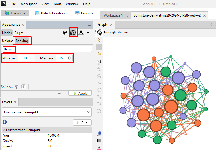
Create and Color Clusters: Now, we need to identify the similar clusters people and give the clusters different colors so that we can start to make some sense of what we see in order to try to gain insight from the graph. In the "Statistics" tab, click on "Run" on the "Modularity" line of the "Community Detection" section. Use the defaults, and click "OK" in the popup window. This is a non-deterministic operation so that if you click "Run" again, it will give a slightly different number. It uses the Louvain community detection algorithm which Dr. David Stumpf reports in his "Graphs for Genealogists" software does a very good job of separating out the different branches of his own family tree.

Back on the left side tool bar, in the "Appearance" section's "Nodes" tab's "Partition" tab, select the attribute of "Modularity Class". Then click "Apply". Since the default is that the icon of an artist's palette was selected, you will see that each cluster/class has a unique color and number (starting from class 0). Once you click "Apply", your graph will show these colors applied to it.


Enhancing the Nodes and Edges: So far, our nodes show and edges show no information other than the connections. We need to know which testers are in which nodes, and it will be useful to set the node's circle size based on how connected that person is to the others in the Generations Matrix. In the "Appearance" section, click on the nested circles icon at the top (to the right of the artist's palette icon). Then in the "Ranking" tab, click on the "Degree" attribute in the pulldown list. I change the minimum size to 10 and the maximum to 200. Then click "Apply". Keep in mind that, because these are the most-connected people, even the smallest circles are highly connected.
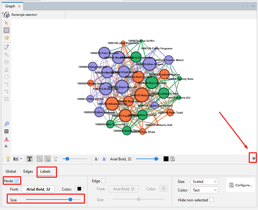
Set the node labels on the tool bar at the bottom of the "Graph" section. At the right end of the bottom toolbar is a stylized up-arrow (looks like a tiny house). Click on that to open the full toolbar. Then click on the "Labels" tab. Click the empty box to check the "Node" section. You can change the font or use the slider to make the labels larger or smaller.
|