|
Data Preparation
What you want as input to yEd is a spreadsheet with one line for every marriage, with the man in the left column and the woman in the right column (or vice versa if you prefer). (These really were co-parentages in some cases, but the GEDCOM representation lumps them all together for data-manipulation as marriages. And I will refer to them in the same way, since they were actual linkages of one surname to another.)
If you have all of your data in a spreadsheet that is the index or abstract of all the marriages, then as long as there is a column for the man's surname and another column with the woman's surname, you might think that you do not have to do any data preparation at all and can just tell the software which columns you want to use when you import the file. But really you still do have to do some data preparation. So copy your master spreadsheet to an input spreadsheet, and then work in that input spreadsheet. Delete any marriage that do not have surnames for one or both spouses. And standardize the spelling of variants of surnames, so that you will really be able to see how families connected with each other (see more on this below). Then use pass the input spreadsheet to the graphing software.
But if your data is in a database, you have a bit more work to do, since you need to pass the data from the database into a spreadsheet.
My original data preparation was for the purpose of identifying all the surname pairs. The master location of the database for all of my projects is a database (one for each project) on Ancestry.com. This could be donwloaded as a GEDCOM file and imported into offline family tree software products. But what I really needed was a list of all the marriages, as the source of the surname pairs needed for graphing. And I also needed to standardize the variant spellings, in order to accurately reflect the connections between surnames.
- Step 1 - GEDCOM to Spreadsheet
The first step is to create a list of surname pairs from all the marriages in the database.
I did this with Legacy Family Tree software -- although not in the most logical way. The most logical place would be for Legacy to allow you to output the Master Marriage List to a CSV file. But they only allow it to output to hardcopy or (in the deluxe version) to a PDF file. So print it to a PDF file. Then go into the PDF file (with Adobe Reader) and select all and copy it all and paste it as text into a spreadsheet.
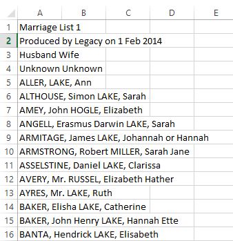
What you will wind up with in the spreadsheet looks like this (click on the image for full size):
- Step 2 - Spreadsheet Cleanup
Clearly, the raw form of the pasted information needs to be molded into surname pairs. And there are a number of problems to resolve in doing that. The irrelvant lines (such as lines 1-3) need to be removed. And the husbands and wives need to be put into separate columns. And the surnames have to be extracted and the given names and commas discarded. There are multiple ways to do this, and someone with more Excel skill than I have may know a more efficient way to do some of these tasks, but the following steps will work. I actually make a copy of my worksheet after doing each of these steps, so that the next step is done on the copy and the original forumlas are not lost, in case I have to go back and do something later -- such as capturing new marriage data from the updated database or from an entirely different database. Once you have entered all the formulas, you really do not want to simply delete them; so copy that worksheet to a new one and delete or overwrite the formulas in the new worksheet.
- Step 2A - Eliminating Irrelevant Lines
This is actually quite simple to do, even on a list of several thousand marriages. Click on the A at the top of the A column, to highlight the whole column. Then insert a column to the left of the data column. (I use the keysboard ALT + I, but you can also do this on the HOME menu's Cells section, where you can choose "Insert" and its "Insert Cells option.) This will move the data to column B and insert a blank column A. In cell A1, enter 1. Then with the cursor still in cell A1, use the keyboard and holding down the Shift and Ctrl keys, also press the End key. Then, still holding down the Shift and Ctrl keys, use the left arrow key, to move the cursor left so that only column A is highlighted (down to the last line on which there is data in column B). Now either use the keyboard and holding down the Alt key, press E, then I, then S (letting go of each one but still holding down the Alt key) or else on the HOME menu, in the Editing section, click Fill and then its Series option. Both methods will pop up the series box. Make sure the step value is 1, and then click OK. This will fill column A with the numbers 1, 2, 3, ... up to your last marriage line. Now sort both columns A and B (DATA / Sort) by column B. Now scroll down to where you find a cluster of lines saying "Husband Wife" and delete all those lines. Then scroll further down to the cluster of "Marriage List ..." lines, and delete all those lines. And then scroll down and delete all the "Produced by Legacy ..." lines. Now sort both columns again but this time make column A the one that you sort on. Finally delete column A, so that the data moves back into column A. And you have now removed all the irrlevant lines without losing the original order of your data lines.
- Step 2B - Separating husbands and wives into different columns
This is definitely something that requires some Excel skill. And it is not going to be easy when there are marriage without given names or surnames of one of the spouses. Start by taking a look at several of the marriage lines. Notice where the commas and spaces are. The format is husband surname, comma, space, husband given names, space, wife surname, comma, space, wife given names. There is also the unique "Unknown Unknown" line; simply delete that line, since it cannot yield a surname pair and complicates the creation of a general purpose formula for handling each line. Clearly, there are two different patterns in the marriages: one for marriages with all the names and one where the husband's given name is blank (e.g. "ALLER, LAKE, Ann"). So the method has to take both of these into account. We are actually saved some work by the fact that all we really want from each person is their surname.
We will generate some new columns of formulas. Then when we are done, we will copy and paste only the values back into their same places. And then we will delete all but the surname pair columns. We have to search for the first comma and then put everything to the left of that into the husband surname column. Then we have to take everything to the right of that comma and search for the second comma and then take everything to the left of that comma into a new column and then search that column to find the last space and then take everything to the right of that into the wife's surname column. Just to be safe, I will also use the TRIM function, in case there are any unnoticed leading or trailing spaces. As I said, this takes some skill in Excel.
I'll use columns B and C to capture the husband's surname, which is the easiest part. In column B1, enter the formula "=FIND(",",A1)" (without the outside quotes). This finds the position of the leftmost comma for the first marriage. In column C1, enter the formula "=TRIM(LEFT(A1,B1-1))" (again, without the outer quotes). This captures the husband's surname.
I'll need several columns to capture the wife's surname. In column D1, enter the formula "=TRIM(RIGHT(A1,LEN(A1)-B1-1))". This captures everything to the right of the space after the leftmost comma in the original marriage text in cell A1. (The TRIM() is probably unnecessary but does not hurt anything.) In column E1, enter "=FIND(",",D1)", which finds the location of the rightmost comma. In column F1, enter "=TRIM(LEFT(D1,E1-1))". This captures everything from D1 that is to the left of the comma. Now comes the real golden bullet, capturing the last word of the remaining text that is now in F1. In cell G1, enter "=RIGHT(F1,LEN(F1)-FIND("|",SUBSTITUTE(F1," ","|",LEN(F1)-LEN(SUBSTITUTE(F1," ","")))))". This captures the wife's surname unless the husband had no given names, in which case it gives "#VALUE!". So finally in cell H1, enter "=IFERROR(G1,F1)". This uses the wife's surname from column G1 if it is present and from column F1 if G1 is the error value.
So you now have the husband's surname in C1 and the wife's in H1. But you need to copy all these formula cells for every line of marriages in your spreadsheet. So use your mouse to highlight cells B1 through H1. And then on the HOME menu, click copy. Then use the keyboard and holding down the Shift key, press and hold the Ctrl key and then the End key. This will highlight all the cells in columns B to H in your spreadsheet. Let go of those keys, and on the HOME menu at the far left click the little triangle under "Paste" and then click the "Paste Special" option. This will open the Paste Special pop up box. Click the circle next to "Formulas", and then click OK.
You'd like to rely on the results, but you really need to scroll through all the lines of the spreadsheet, looking for anomalies and manually correcting them. For example, a two-word surname will have been choppped down to one word by this method. So watch for a VAN COURLAER surname in the original data, which will have been chopped to COURLAER and correct it to VAN COURLAER. If there is a line with one of the surnames Unknown, simply delete that line. Or there may have been some lines with more than two commas. There are almost always some special cases that the general solution does not handle. So just correct those as you find them. This is a very important step; so do it carefully or you may wish later that you had.
Now that all the surname data is as correct as you can make it, it is time to replace the formulas with their computed values, thus locking in the surnames for the husbands and wives. At the top highlight all of columns A through H. Then on the HOME menu, click COPY. Then click the little triangle under paste and again click on Paste Special. This time, in the Paste Special pop-up box, click the circle next to "Values", and then click OK. Now delete all the columns except C (the husbands' surnames which will end up as column A) and H (the wives' surnames which will end up as column B).
- Step 3 - Standardize name spellings.
Spelling, even in modern records, can be inconsistent. Prior to the late 1800's, it could be extremely variable. We want the surname conncetion graph to show how families are related. So we do not want all the variants for each surname. We want a standardized spelling for those names that occur with variants. So you have to go through all the husband surnames and replace the variants for a name with the spelling that you have decided will be the standard for purposes of the graph. I mark all standardized spellings with an asterisk after the name, so that I know that these include variants, which I can examine if any later questions come up. Be sure to look for variants where the first letter as changed (e.g. Tillingham and Dillingham).
The list is sorted by husband surname, since that is how the original PDF file showed it. So after standardizing all the husband surnames, you need to sort the marriages by wife surname and repeat the standardization, making sure that you standardize wife names with the same standard spelling as you used for the husbands.
Finally, sort the list back into order by husband surname, with the wife surname as the second level of the sort. And at long last, you have your surname pairs. Different software packages may require further configuration of the data, in order to be read by the software package. But you now have the data that you need, which can be reformatted as necessary.
|
